Steve Day's picks (STE'86 at CSDB)
Steve's thougts on compo: As you know i am more than a little disappointed that the majority of the artists who would class themselves as "top 10" on csdb have singularly failed to stand up and be counted on this. indeed there are several on there that i would if i was a suspicious man :) accuse of purposefully trying to turn this compo into a laughing stock to cover up the fact they felt inadequate to the task.
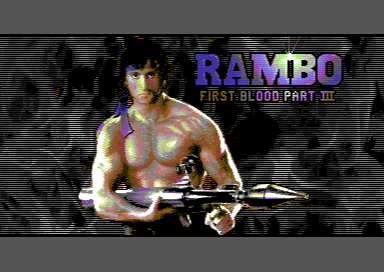
1. Kenzbo. (CSDB)
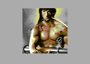
Like the fire, like the white text which contrasts well. Would have dearly liked to see this with more time spent cleaning up and detailing the figure. I think this has the potential for being the definitive Rambo pic if that was done with the additional text on it reminds me of SIT's robocop pic.
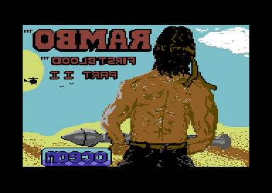
For me the winner because it fulfilled the criteria of the "spirit" of the compo which Roman first described to me when he began it. That being a predominantly hand drawn screen based on Rambo which could be a loading screen for the game.
2. Rambo construction kit (CSDB)
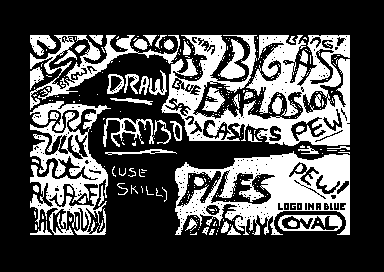
cant really vote this number one in a "proper" compo even tho part of me would like to. really made me smile as i read all the bits. "draw Rambo here (use skill)" had me laughing out loud.
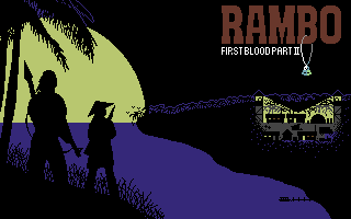
3. Gee, when did they release this one? (CSDB)
4. All in your head (CSDB)
interesting solution to the task. execution is novel as it bears more of a resemblance to a vector illustration than a raster one. captures stallones downturned mouth and "sleepy" eyes well.
5. Rambo-X (CSDB)
interesting shading style, reminds me of real world chalk/pastel drawings using the edge of the pastel rather than the tip. creates tonal areas of vertical and 45 degree edges like this one. observations are that the eyes are slighly too high on the face and are 1 MC pixel too far offset to the left side of the screen for "balance".
6. Sly vs Sly (CSDB)
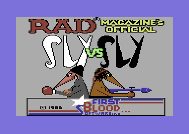
was, i thought, the best pun produced in the compo. perfectly fitted MAD magazine's ethos, and would, i should think have been something they would have been interested in printing back in the day.
7. Rambo 2 (CSDB)
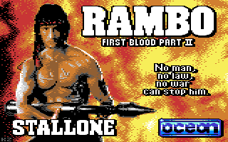
I really hoped for more hires entries in this compo based on Dave Thorpes spectrum loader. however this one is a very creditable effort, the background is white rather than yellow flame but thats fine because it still looks "right" probably due to it being very reminicent of the First Blood poster.
Observation on this one is only that the straight left side side of the nose is too stark and needs "shaping". i did check this and you can add shape with the brown ow i wouldnt have commented on it.
8. Rambo (PETSCII) (CSDB)
9. Ramdiskbo (CSDB)
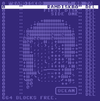
I liked this. very clever interpretation. but then i was always impressed by "teletext" graphics on bbc ceefax in the 80's
James Svärd's picks (JOE at CSDB)
Some thoughts about the Rambo Revisited compo: Thematic competitions still seem to be somewhat underestimated. For some competitions, the general byline or slogan of the party itself might have suggested a thematic character. For most it's basically expressions following in a line of self-reflective subjective responses to a constructed context more or less influenced by other media. This was a clearly driven competition with an original image in mind of a referential experience most of us share, the iconographic imagery of a loader title from our youth.
For most images, which in fact is flat representation of space it comes down to three scale-levels: Detail, Portrait and Landscape (regardless the level of abstraction) Anyone whom have worked with more layers knows that the level of complexity only reaches as far to which it's not understood anymore as well as the contrary: The lowest level where minimalism takes away the last subtle nuance of the translated information (may it be emotional, political, provocative or simply informing, informal, formal etc.)
From the clone, one is most likely to see the diversity and transformation from it's original, so even in this competitions results. The ones who tried to take on the original motive, to optimize and to retain the most photographic closeness, very few seem to have succeeded. And in the opposite direction, those who tried to rephrase and re contextualize the image seem to have been more fruitful..
From what I could notice was not the lack of joy, but perhaps in a way, the lack of love in that joy (of making).
1. Rambo with a view (CSDB)
A clever composition and reading of the original image, giving it spatial context.
2. Ay CaRambo (CSDB)
A transformation of the phenomenon of the soldier to another culture and perhaps time.
3. Rambo (PETSCII) (CSDB)
A smart rendering with extreme economics.
4. Gee when did they release this (Hires) (CSDB)
Very subtle and close to the content and ambiance of the first movie.
5. Ihakaigui (Multicolor) (CSDB)
A different take on the original imagery by choosing a alternative cover.
6. Rambo 2011 (MCI+Sprites) (CSDB)
An updated approach to the original cover, trying it's best to make it contemporary.
7. Kenzbo - First Blood Pt 2011 (CSDB)
A classic reinterpretation with all the quotes.
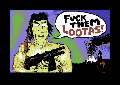
8. Not-so-romantic date in Vietnam (CSDB)
A simple but yet effective image, very contemplative.
9. Rambo Red Hot Flea (CSDB)
Trying its best in dissolving the artist to the display of ready made objects in quite a different imagined context.
10. Toon Blood Part 2 (NUFLI) (CSDB)
Contemporary and very direct as a political satire.
Oliver Lindau's picks (Veto at CSDB)
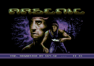
1. Kenz – Rambo First Blood 2011 (CSDB)
oldschool in every sense of the word. solid pixelworks that benefits from the old vic colors. the text elements are dominant but do not harm the motive. only issues imo is that the contures could have been more clear. there are still unpleasing clashes left and not sure about the limited aa on the rambo logo either.
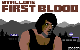
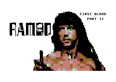
2. Romppainen – Gee when did they release this (CSDB)
actually i found this pic unremarkable at first sight. solid use of hires, but the background felt a bit simple and barren and was not sure about the character either. nethertheless the expression of the face makes this one special, kept me watching it again and again. like twoflowers pic the image looks like cell shading. unique cartoony though not as detailed as ragnarok’s one. imo most interesting re-interpretation in the competition.
3. Malmix – Rambo X% (CSDB)
no3... well executed mc-piccy. like the smooth transitions. there are some minor flaws (i.e. the dithering of the body seem to overlap the front arm).
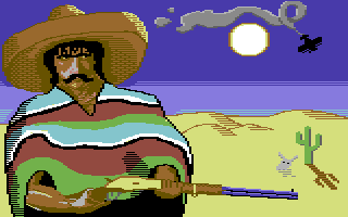
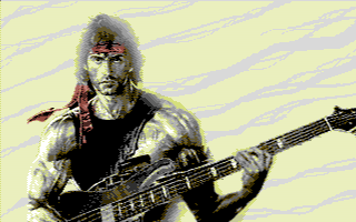
4. Yazoo - Ihakaigui (CSDB)
ok, sly stallone reminds me mr fantastic here, but besides anatomy issues it is a nicely done piccy. solid pixel technique, nice color scheme, oldschool x-ample spirit.
5. Redcrab – First Release (CSDB)
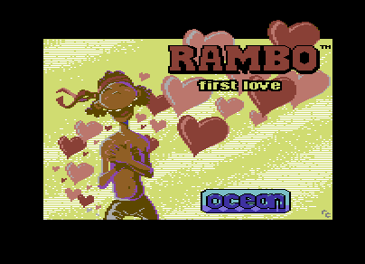
imo best fun production in this compo though execution could have been better. especially the background looks kinda generated and contours rough. nonetheless character and hearts have a good flow. doing the complete opposite in case of war spirit maybe not exactly original, but i like the happiness.
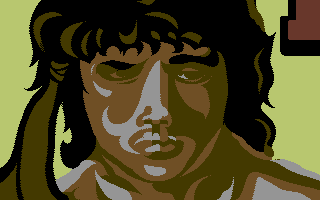
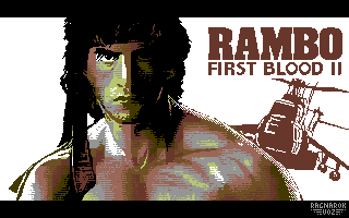
6. Ragnarok – Rambo 2 Title Screen (CSDB)
though based on a convert this one is special imo. colored hires is a weird choice for a wired pic and so is this wild mixture of scanline/chessborder dithering. the result looks a bit messy but unique and stallone got a striking head at last. good job ragna.
7. Romppainen – Not so romantic date (CSDB)
interesting idea. the style reminds me a bit french games in the 80ies. imo more detail would have been nice.
8. Twoflower – It’s all in your head (CSDB)
rambo goes vector flash style. a slight petscii feel, clean shapes. nice.
9. OhLi – Rambo after operation (CSDB)
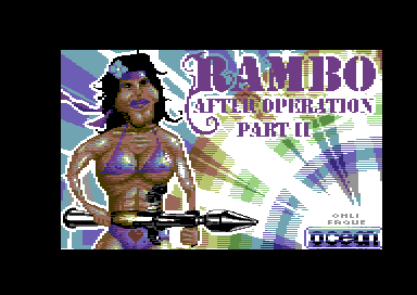
oh, well, ohli. this could have been a winner. love the idea, like the colourful geometric bg. tbh style of the main character (esp the white outline) is not my cup of tea and i got the strong feeling that this is a picture that would have look much better in a non-flicker mode. imo overall a good one.
10. Dane - Rambo 2011 (CSDB)
carrion+deekay+dane conversions are prefabricate houses with attractive front. all of them are looking quite good and combined there are many aspects how c64 photoshop works could be done properly. carrion shows a nice idea and preparation, deekay clean postprocessing and dane most polished overall presentation. still the biggest issue of all 3 is the distinct jpeg look and feel. nethertheless i enjoy dane’s because of the good color usage and the border sprites.